|
| |
Everyone seems to take colour photographs these days, in fact it is quite difficult to get a black and white version except by photocopying and there is not much control over these. For the marquetarian this creates difficulties because it is not easy to judge the differences in tone when different colours are also present. However in today's world of digital pictures and image processing programs there are some very useful tools at hand.
There are many programs available and many incorporate the features described below - but in those examples seen below we will be considering Paint Shop Pro 7. The menus in the program you use may be different from those in Paint Shop Pro 7 but the basic terms are likely to be present. |
|
|
| |
If possible select a photograph that has a good range of tones, and for portraits this may be with the lighting coming partly from one side and higher than the face. The example here is not ideal as it is taken with a flash however it is a good example to show how a range of tones can be generated with the computer.
|
|
|
For displaying the various tones regardless of colour it is necessary to convert the image to black and white greyscale. In Paint Shop Pro 7 go to menu Colours / Grey Scale giving a picture as shown here. At this stage save a copy of this monochrome image so that you can come back to it to try different levels of enhancement.
|
|
|
Separating the picture into a few shades |
|
| |
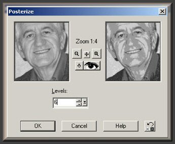
Let us now change the image above into just 6 separate shades. Open your greyscale image and then use the menu item Colours / Posterize . This opens the window shown here with the picture on the left as per the original and that on the right as it would be changed to. At this point you may not be seeing much of your picture in the small windows so click on the little button showing a magnifying glass with a + or - in them to get more in view. To get your screen to show your full image as it might appear when you've applied the filter, click on the button displaying an eye. |
|
|
|
Adjust the number of Levels to the number of shades you want - here we are showing 6 shades. When you have finished making adjustments click OK.
|
|
|
|
|
Enhancing the range of tones in your picture |
|
| |
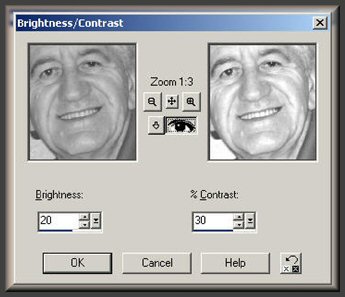
You may feel the result above does not have a wide enough range of tones - so let us try some enhancement. Load up your original greyscale image into Paint Shop Pro 7 then use the menu Colour / Adjust / Brightness Contrast. Initially set the Brightness and the Contrast settings to zero and then adjust the image in the little windows by clicking the + and - magnifying glass button.
Now adjust the Brightness and Contrast, say to 20 and 30 respectively and if you are happy with that click OK. |
|
|
|
If you are not happy with it you can undo your changes by using Edit / Undo and try a different set of Brightness and Contrast values. Note if your picture has too much contrast or brightness, you can have negative values for Brightness or Contrast.
|
|
|
|
|
|
| |
Go into the Posterize mode again and set the number of Levels you want.
Here we show 6 Levels but you may want more or less.
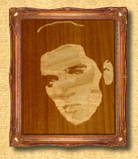
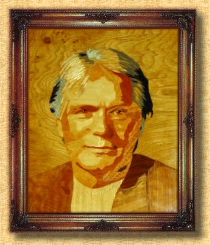
These techniques are just as valuable for buildings and landscapes - it really separates the wood from the trees!
Happy playing!
|
|
|
|
|
|