|
 |
|
|
|||
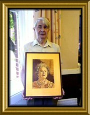 Eddie with his superb portrait of the Queen Mother |
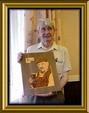
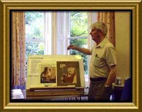 Eddie displays the techniques of portraiture composition in the medium of marquetry |
||
The choice of the subject is of course up to the marquetarian, and the comments below are a method of tackling this, and are not to be taken as rules. You will soon evolve a method that suits you best. The major point with a portrait is to get a 'Likeness' of the subject. To help obtain this, I obtain a monochrome photocopy from the original enlarging or reducing as required. The advantage in using the monochrome copy is that the tonal values are easily seen. From this a line drawing is traced. This ensures all the major features are in the correct position and of the required size. The line drawing is then transferred onto a waster or a chosen background wood. I only use a veneer waster as card can go like papier mache where a lot of pieces are inserted close to each other. At this stage I only mark out the larger areas of tone and shade. I do this so that these areas can be cut in without the worry of the fine detail, these can be cut in later. I use a waster because I do not want the background to dictate the toning of the portrait; it also enables me to position the portrait to the best advantage of the background grain and tone, The larger areas of tone are cut in, in a block form. This includes the hair and clothes. For the face select three veneers, a light, mid-tone & dark (more portraits are spoilt by using TOO dark veneers, than any other reason) I use Bird's eye Maple for the Middle tone, Figured Sycamore for the light tone and light Mahogany for the dark tones. These tones are kept as close as possible. As a general rule the younger the person, the closer the tones with a bigger contrasts for the older face. The total area of the face is cut in using the mid-tone and the darker areas are then marked on this, and then cut in. The light areas are marked on these two and then cut in. Smaller lighter and darker areas can be put in later. Put the features in a 'going down' the face direction. This allows you to see the face as it builds up. Eyes First Keep simple. All white first and then cut in two areas for the iris, small shadows i.e.: under the top eyelid and in the corners. Highlights matching in both eyes and if dyed wood is used for the iris 'not too bright' Nose The three veneers used for the face will have outlined this, so only the dark apertures (do not use black) and the highlights to be added. Mouth Lips are not Bright Red, (unless lipsticked) the top lip has more colour than the lower. It is outlined with a light line with two spears of the same colour going towards the nostril. The lower lip is outlined by the shadow on the chin. Any teeth showing are not TOO white as they are usually in shadow. Chin & Neck Under the chin is a strong shadow, any lines on the neck of an elderly person should not be over emphasised (it's not tactful or necessary). Ears Most portraits only show one ear or none, and this will have been shown in the three tones, just small areas of light and dark will be required to bring these to life. Hair and hands Keep the hair simple, areas of light only; I resist the temptation to use slivers and a lot of fine lines. A few fine lines on the edge of the hair help to tie the portrait to the background. Hands are difficult, but using the three tones, and the accurate tracing you should have no problems. On small portraits I often use the knots in birds eye maple for fingernails. Face Compare the picture with the original, start filling in the finer details, go round the face, eye brows, lines round the eyes, crease from nose to mouth, small highlights. at the tip of the nose ,edge of the ears, lobes. A few darker shadows on one side of the face. I use about six tones in all, Again keep it simple, if you do use slivers keep to the minimum. Clothes Again keep simple, let the wood do the work, and select veneers with grain and shades so that fine lines and details are kept to the minimum. Background This filled in profile is cut from the 'waster' and offered up to alternative backgrounds, twisted and turned until the best position is obtained. Fix the profile to the background with double sided cellotape, cut round it remove from background and drop in the profile (i.e. reverse of the window method) Do not over detail the background, it will take attention from the portrait. Finish From here the portrait is treated as a standard marquetry picture, cleaning and finishing and laying etc: is to your own preference and skill level. These remarks are general and to give help or advice on a specific portrait I would require to see the original picture or a good copy. (See also the article in the Marquetarian 143.) SMALL FACES A number of Marquetry pictures have disappointed me in the past, the small faces of the people shown in them have been crude or not quite right. I agree that we are not all artists, but we all see numerous faces every day and at varying distances. Having felt that this was an area that was of interest, and having made a remark about it after judging at Chelmsford, I reckoned it was up to me see whether how easy or hard this subject was. I do believe that to criticise and not advise is a negative move; I therefore have since kept my eye open for any information to offer. Pictures that we copy, whether they are our own photo’s or other some other source, give a very distorted view when applied to faces, a photo taken of a person say at five paces, when a head appears to be about five inches high, when developed will show it possibly an inch high, with completely the same fine detail, should we look at a person in the street at the distance where the head is one inch, there will be far less detail although we know it is all there. This is also applicable to other pictures, famous paintings are quite often six feet by four feet, when reduced to a post card, and because of the marvelous machinery of today, you can still see a blade of grass, We then try and copy this (Sliverisation and other techniques are used) the same applies to faces, because the eye still shows as two white triangles either side of a very dark centre we have a go, on a face in the street of this size we would not see the white and the dark's at the most would be a short line with a dot under but touching it. Artists are often advised to screw up their eyes when looking at a subject; this cuts out the fine but confusing detail. Do this with the picture you are copying if it contains figures or faces, and only put in areas as seen this way. I do appreciate that a number of people judge Marquetry by the fine pieces, unless it is a miniature, these details are not always required. Shadows make the form, no shadows = no form (again a comment made to artists), the same features on a face at any distance make the same shadows, eye sockets, nose, and side of the face away from the light and under the chin. Of course the mouth will show, but after a certain distance only as an extension of the shadow down the side of the face. What I am trying to say is that by trying to copy too faithfully we make our hobby difficult and give ourselves a greater chance of getting it wrong. As I quite often point out, most people that see our pictures are not Marquetarians, therefore the picture must be right, despite the medium being wood. Eddie Stevens 2004 |
|||
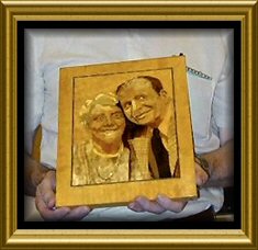
 Do you recognise these portraits? Hover your mouse over the photo to find out if you are right. |
 Eddies portrait of "Bert" |
||
|
|||